


Awareness - To inform users of proactive actions
Feedback - To identify wrong actions and adapt correctly in future
Problem space 1 of 4

PROBLEM
Hunch visibility
In the current model, Hunches activities are buried within the settings, requiring users to navigate three levels deep in the hierarchy. This makes Hunches difficult to locate and the reason for lack of awareness within users.
IDEATION
Voice UI - Prompted by spinning rim lights | Users found it too intrusive
Hunch activity on the home screen | Consuming too much real-estate
These yellow lights are notifications for Hunch actions. Want me to walk you through them?
Actions I took based on your patterns to make it easier for you
Hey Alexa, what’s with the spinning rim lights?
What do you mean Hunch actions?


3

ITERATIONS
Added a Hunch tab in bottom nav bar | Not feasible, feature not prominent enough (pushback from Amazon)
Used scalable solution and add a Hunch pill | Pill could get lost (out of viewport) when they shuffle
FINAL SOLUTION
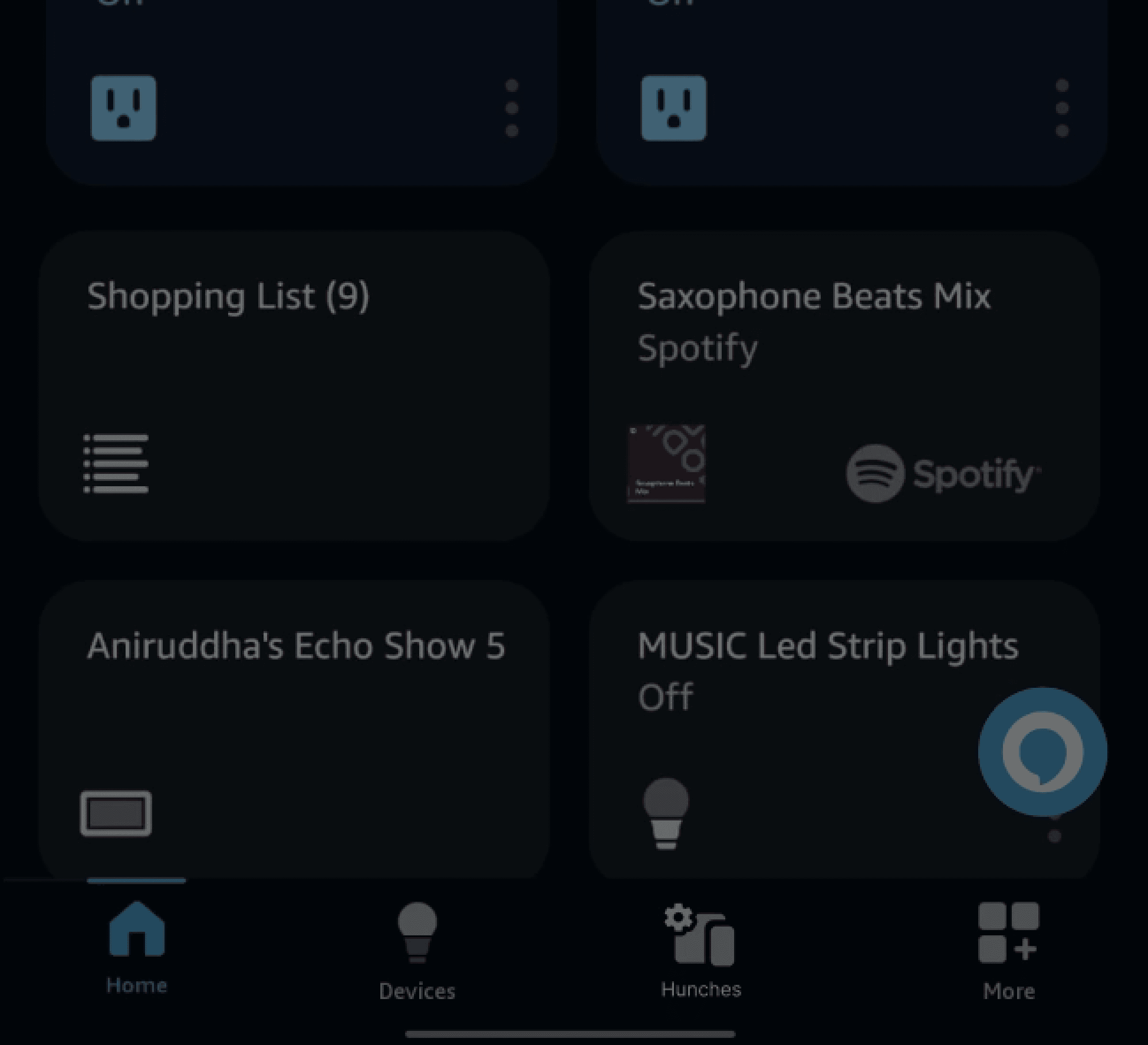
A new "Hunches" section now appears on the home screen to alert users of actions initiated by Alexa
A new tag introduced in the device tile will inform users of proactive actions performed on it
Rationale
Visible on the home screen draws users' attention. Used scalable design system for consistency and easy building.

Hunches
3 updates
MUSIC Led Strip Lights
Off | Automatically triggered by Hunches
*Similar ideations and iterations were made before reaching final solutions for other problem spaces. I've left them out to keep things simple here. Feel free to reach out to learn more :)
Problem space 2 of 4


Turned off by default
PROBLEM
Notifications
Currently, Hunch notifications are turned off by default. Turning on applies to all devices causing notification fatique.
Solution
Selective notification(Alexa app): During device setup or through 'Hunches' page
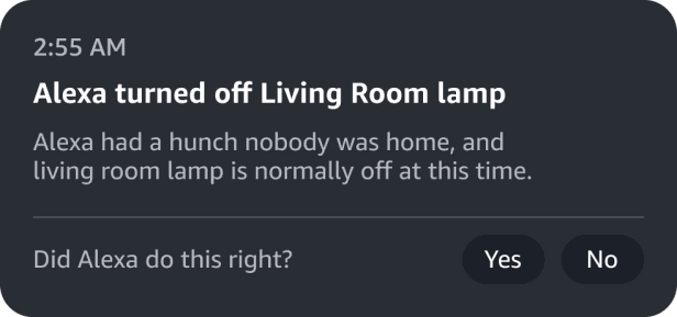
Echo Show notification:
Non-intrusive pulsating notifcation
Rationale
Users prefer notifications to be semi-proactive, except for critical situations (learnt from interviews and Co-design workshop)
OR
Device setup
Hunches page
Problem space 3 of 4
PROBLEM
Contextual feedback
The existing feedback page only collects a simple ‘Yes’ or ‘No,’ which isn’t enough to improve future actions.
WHAT WE LEARNT
Voice and text input interactions were not preferrable by users.
Reviewed how Hunch actions work to define clear, predefined options that users can simply select.


FINAL SOLUTION
Introduced a two-step contextual feedback system (on hitting No) that makes Alexa’s assumptions, derived from studying Hunch anatomy, transparent and asks which one was incorrect.
This helps Alexa become more context-aware and refine future proactive actions.
Rationale
Users prefer agency - so gave them a 'choice' to provide additional feedback. Users also hate to type, so added predefined options by studying how Hunch works.
Problem space 4 of 4
Users
"Giving feedback a couple of times doesn’t sound so bad, but I honestly can’t see myself doing it for weeks or months"
PROBLEM
User retention
How can we encourage users to provide feedback for long?
Solution
Added a transparency page that shows how their previous feedback have improved Alexa's actions.
Rationale
Research suggest users were more likely to give feedback when the impact of feedback was transparent.

RECAP
Consistent end-to-end userflow across both devices


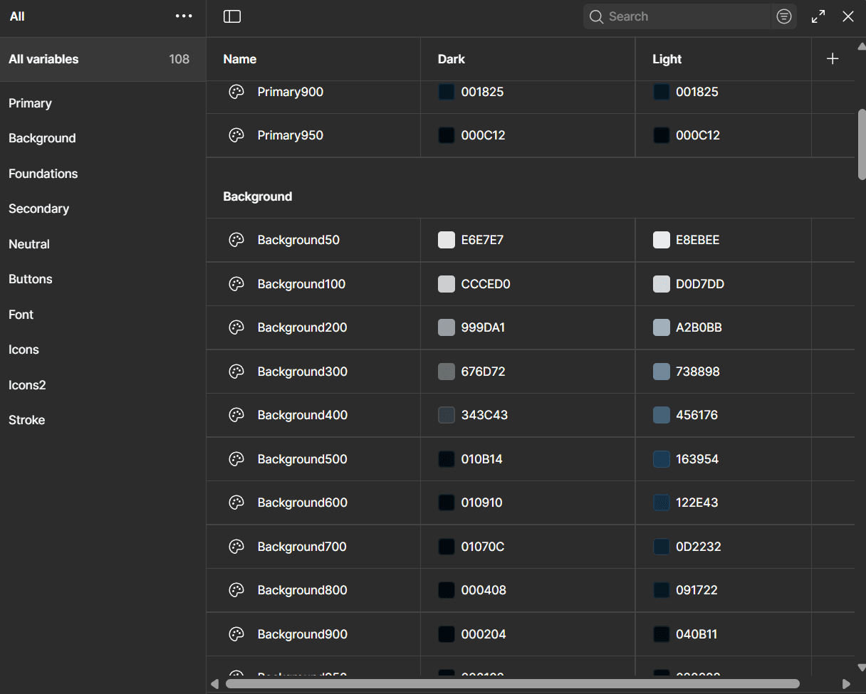
DESIGN SYSTEM
Consistent end-to-end userflow across both devices
Variables, tokens and modes

Component library


